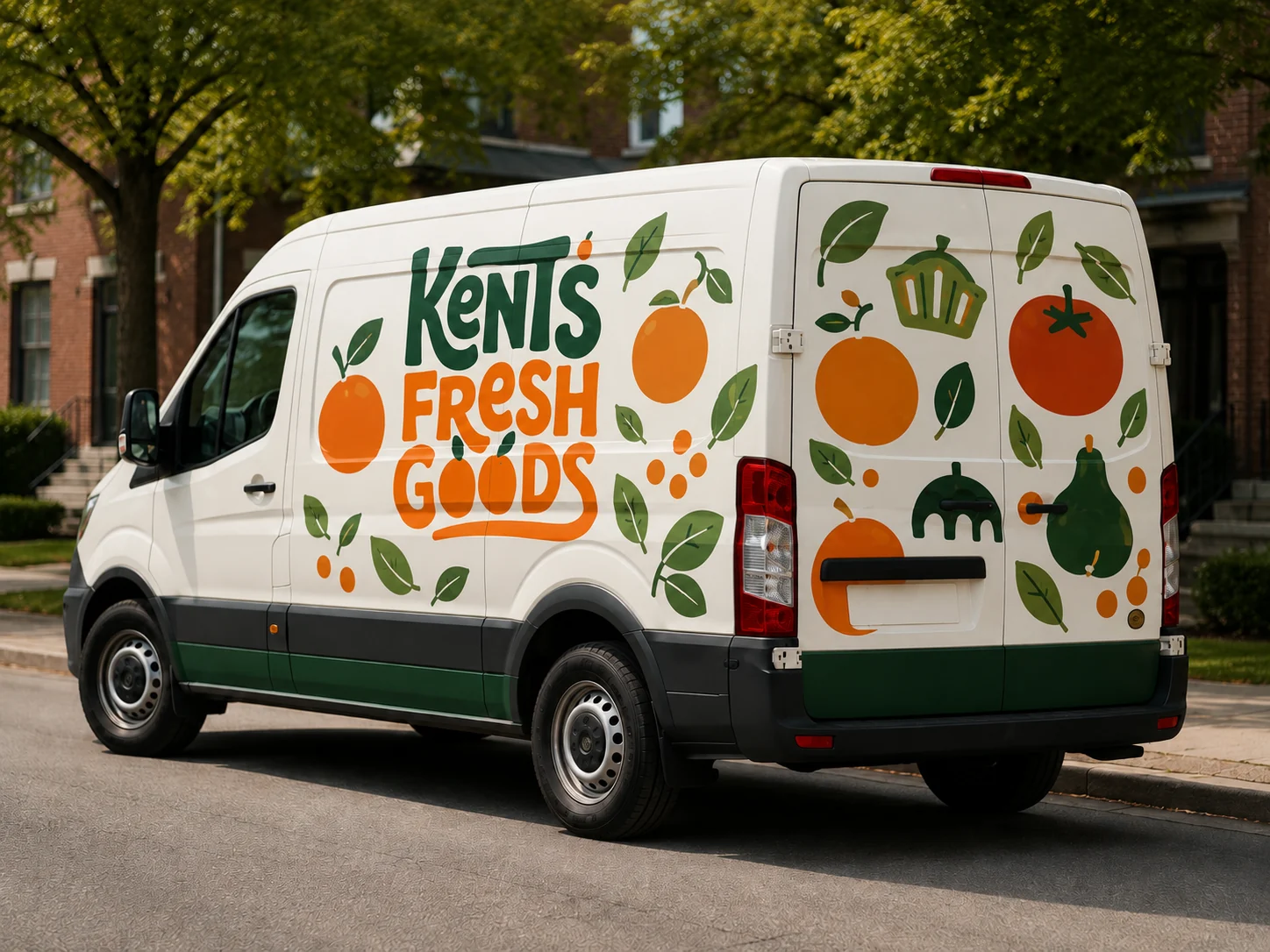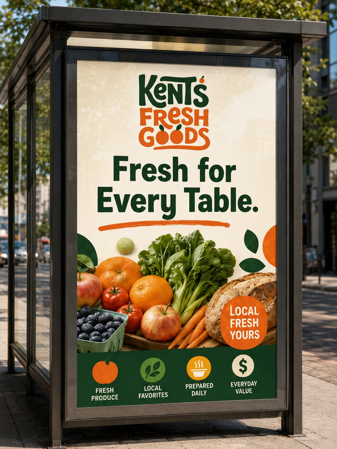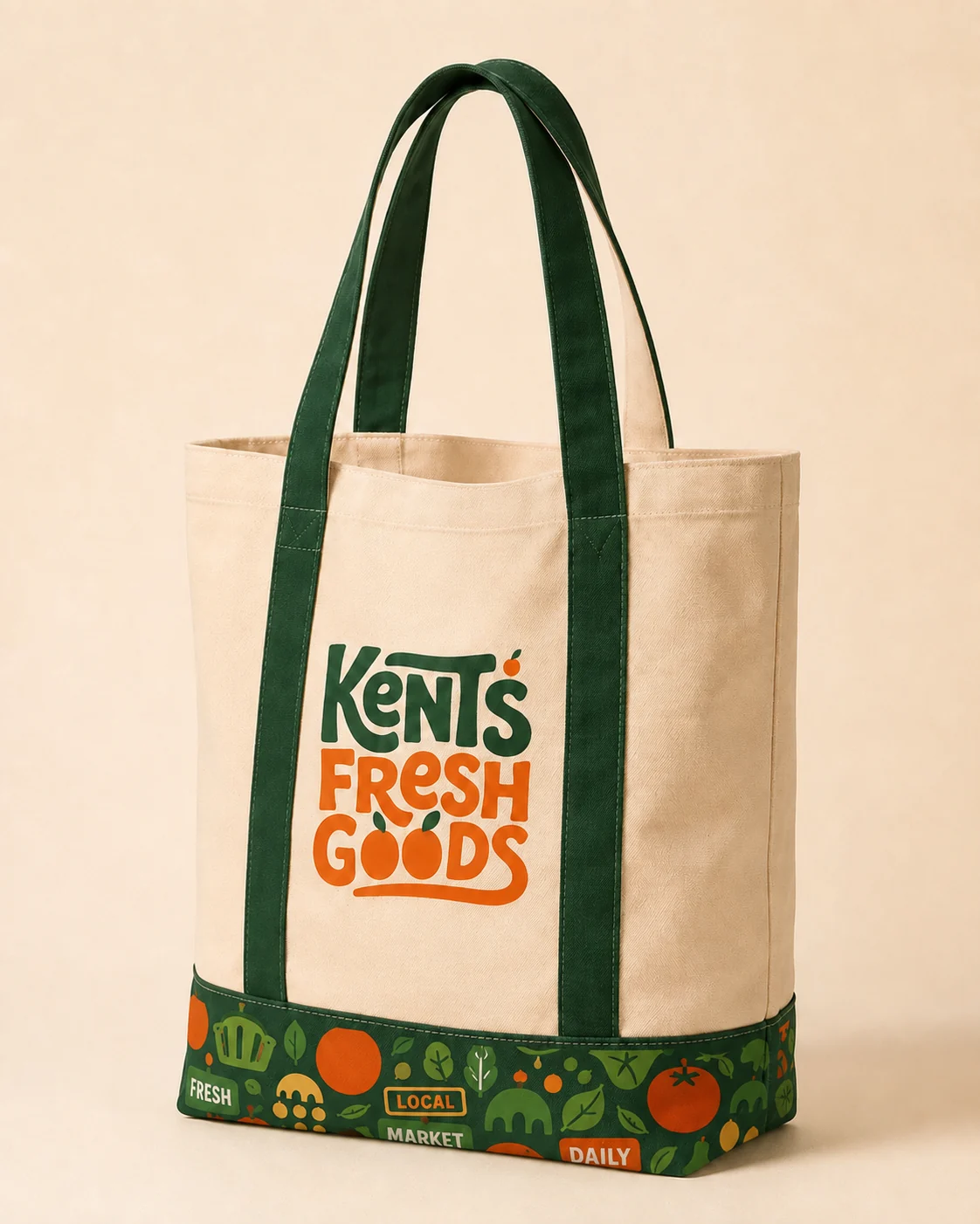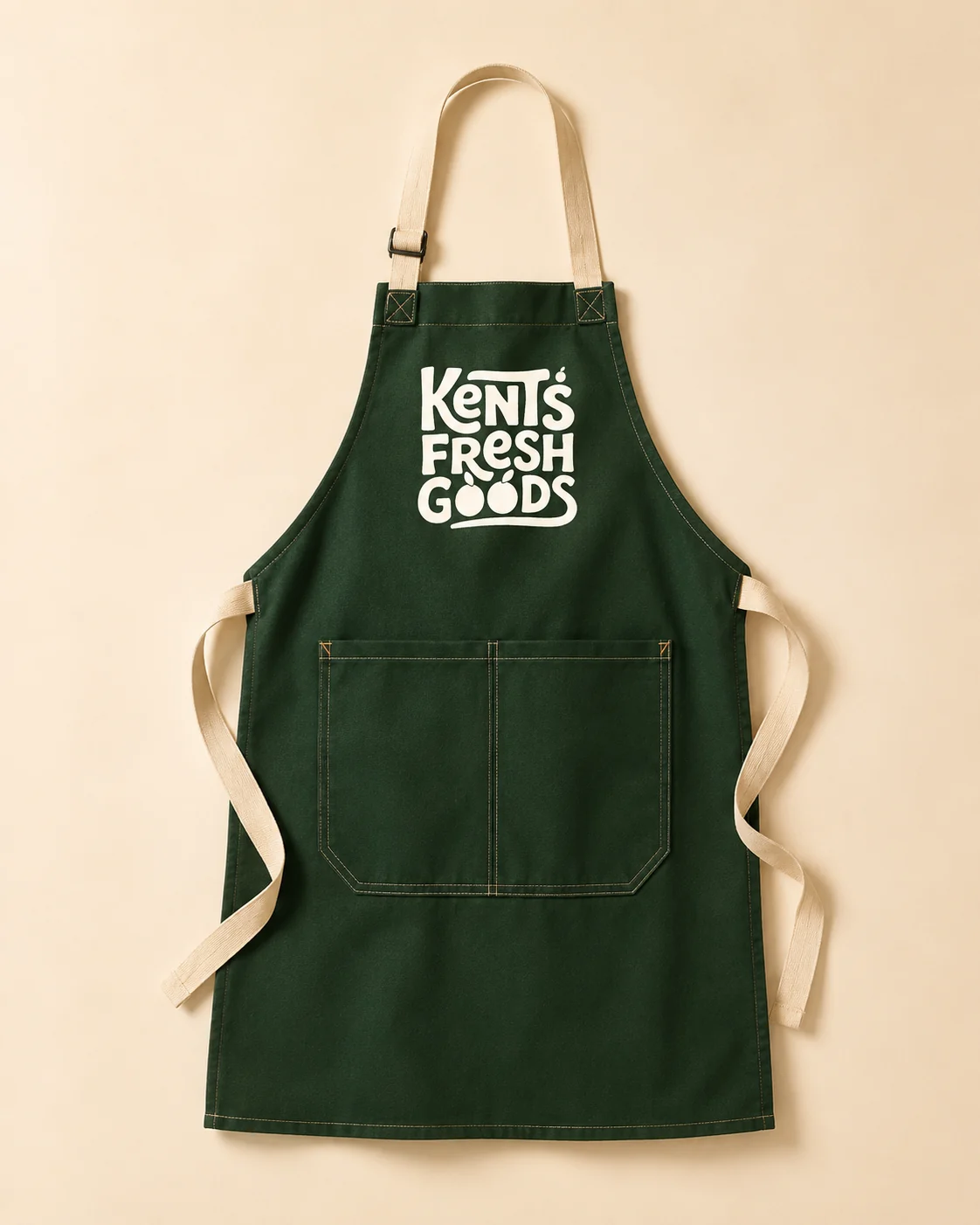
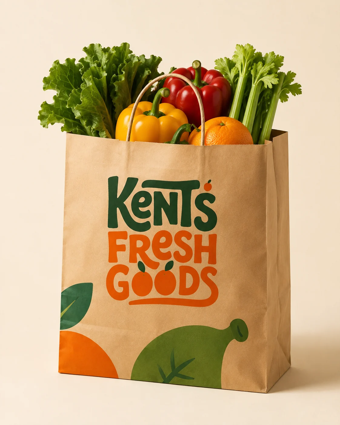
Kent's wanted to trade the polished big-chain look for something warmer: a brand that feels like a local market you actually want to shop, and that holds together from a produce bag to a full shelf of private-label goods.
The answer is a hand-lettered identity, citrus-forward and friendly, that still reads as credible and organized on a crowded shelf.
The wordmark is drawn by hand: a rounded forest-green Kent's, a little orange standing in for the apostrophe, over a juicy Fresh Goods where the letters ripen into citrus.
Three colors carry ninety percent of every surface, Forest Green, Fresh Orange, and Warm Cream, set in friendly, rounded Nunito with a supporting cast for produce, bakery, and urgency.
Every Table.
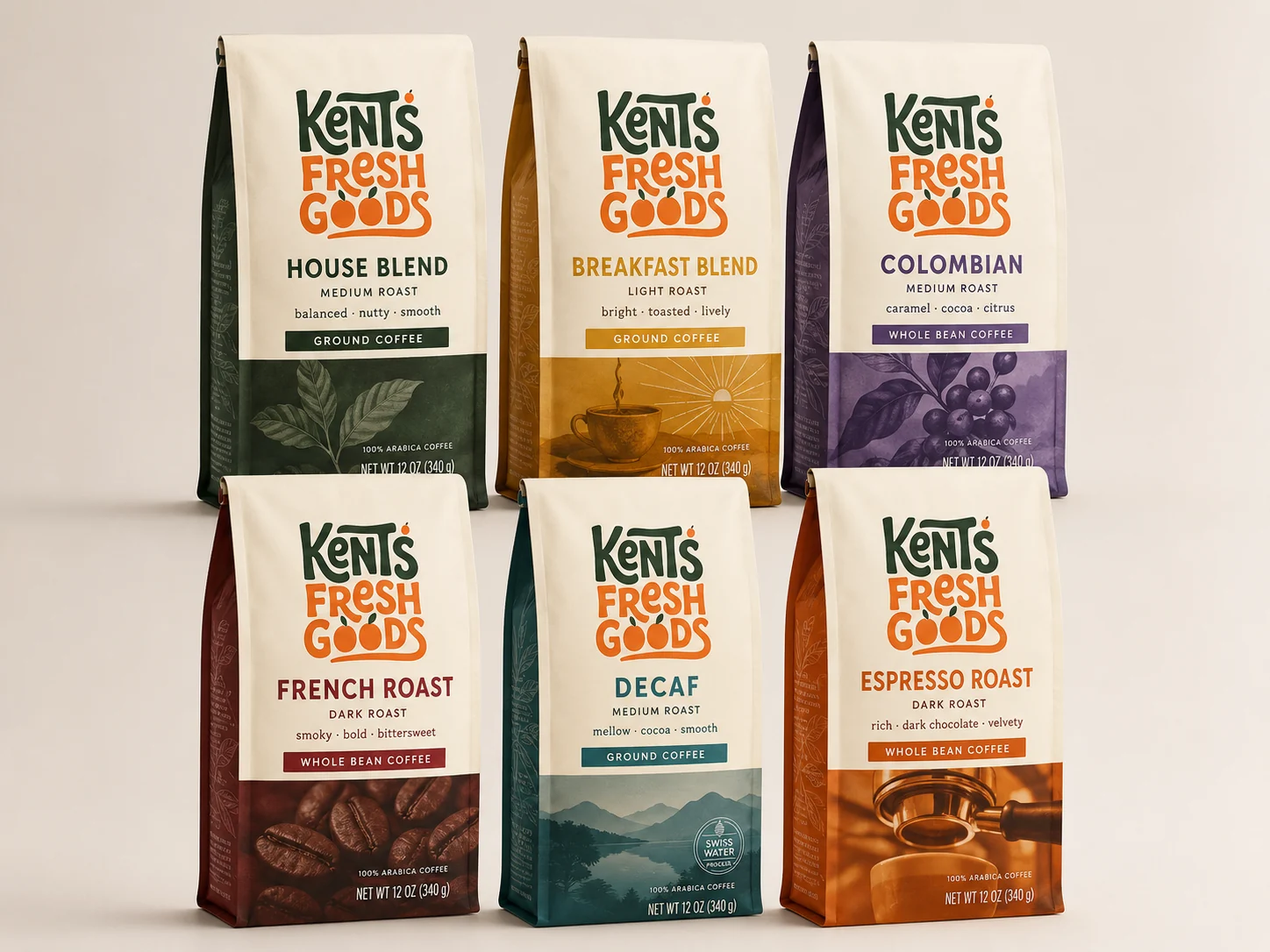
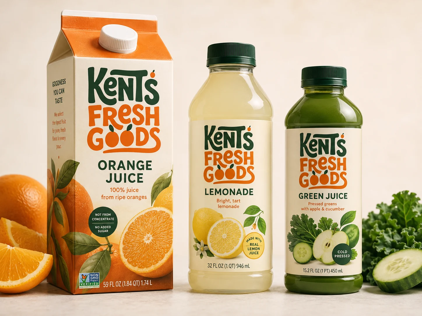
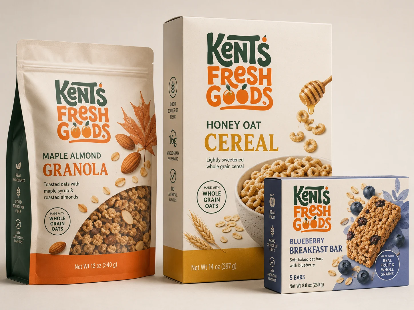
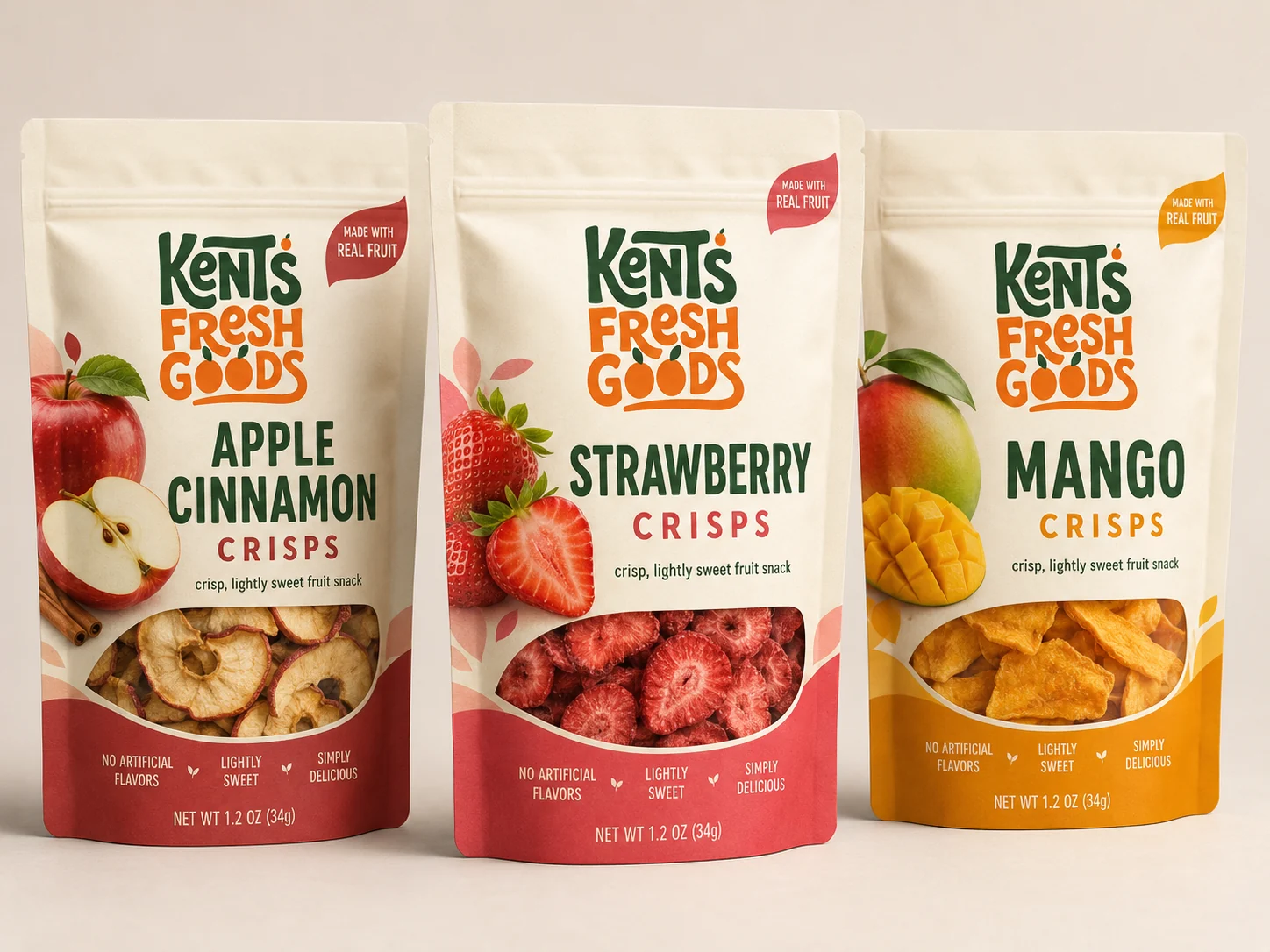
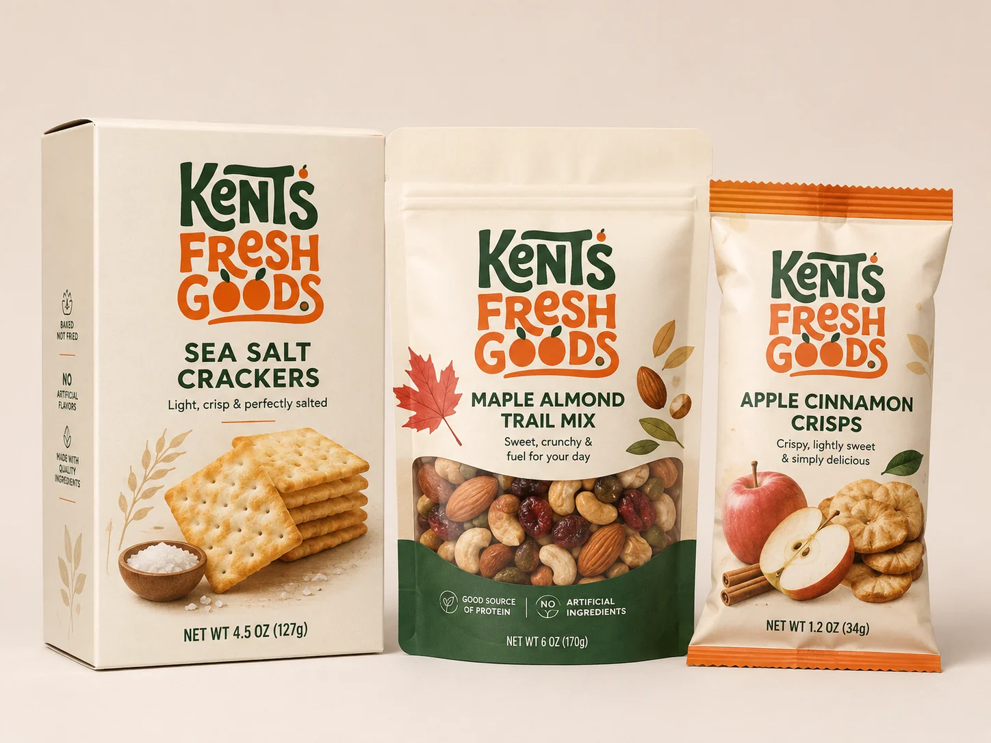
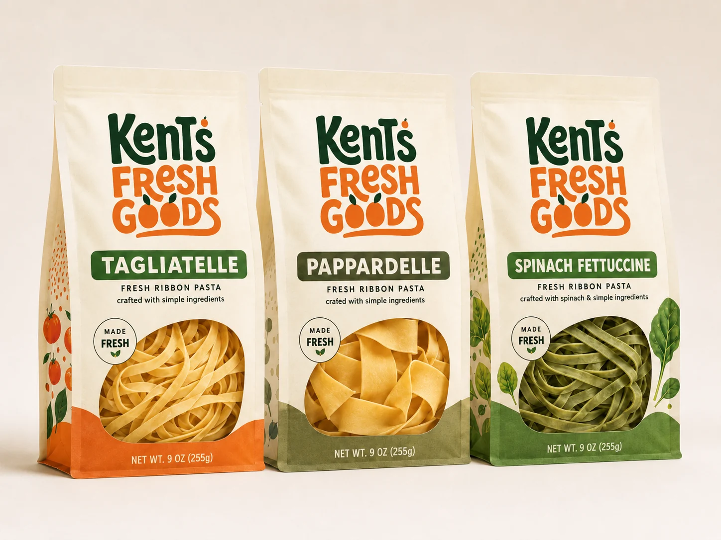
The system stretches across a full private-label range, coffee to cold-pressed juice to fresh pasta. Every pack shares the mark, the palette, and a simple honest layout, so a whole aisle reads as one family at a glance.
Off the shelf, the brand keeps moving: a produce-covered delivery van on the block, a transit poster at the stop, a canvas tote for regulars, and a forest-green apron for the people who bag it all up.