
PNA Technologies converts conductive and non-conductive flexible materials into precision gaskets for aerospace, defense, and uncrewed-systems programs, work measured in thousandths of an inch.
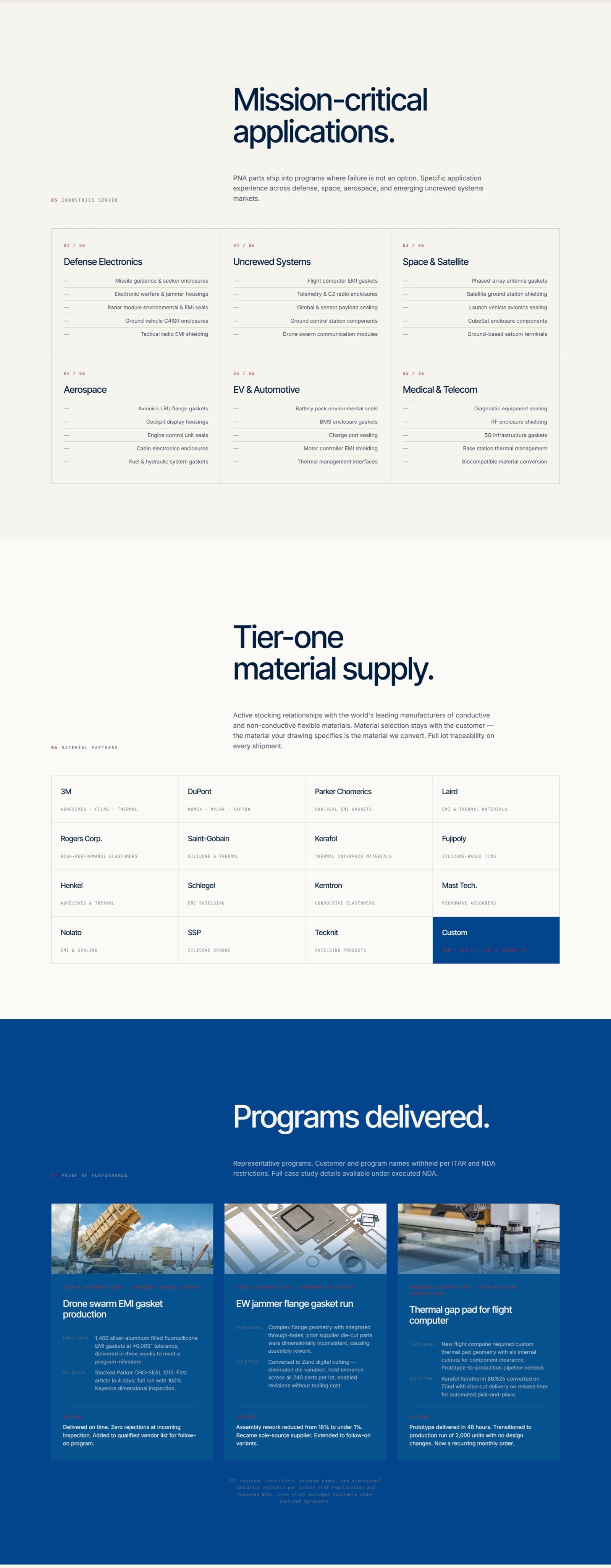
The engineering was mission-critical; the brand presentation wasn't. Sales collateral, the website, and social each spoke a different visual language, and none of them signaled the precision and traceability that defense and Tier-1 buyers screen for before they ever request a quote.
The brief: one system, credible to a procurement officer, that could run from a printed capabilities deck to an Instagram post and still read as the same company.
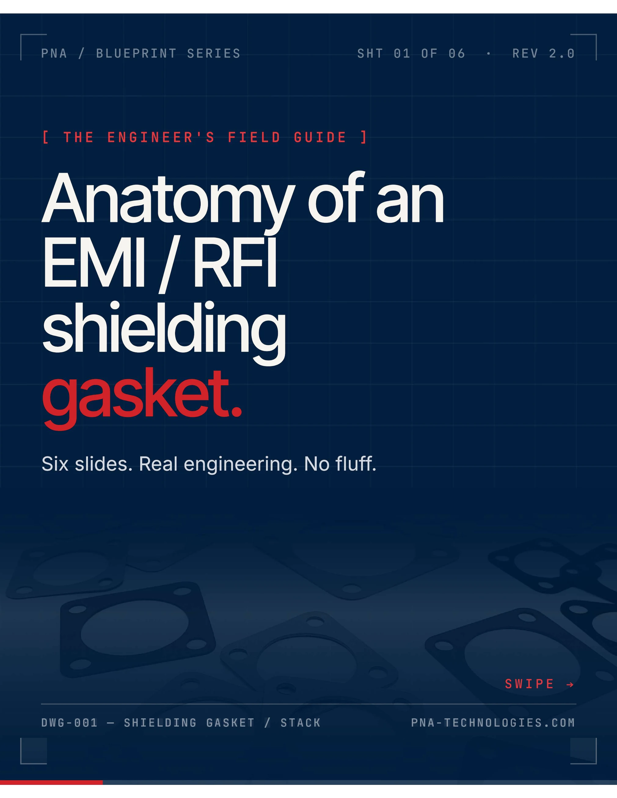
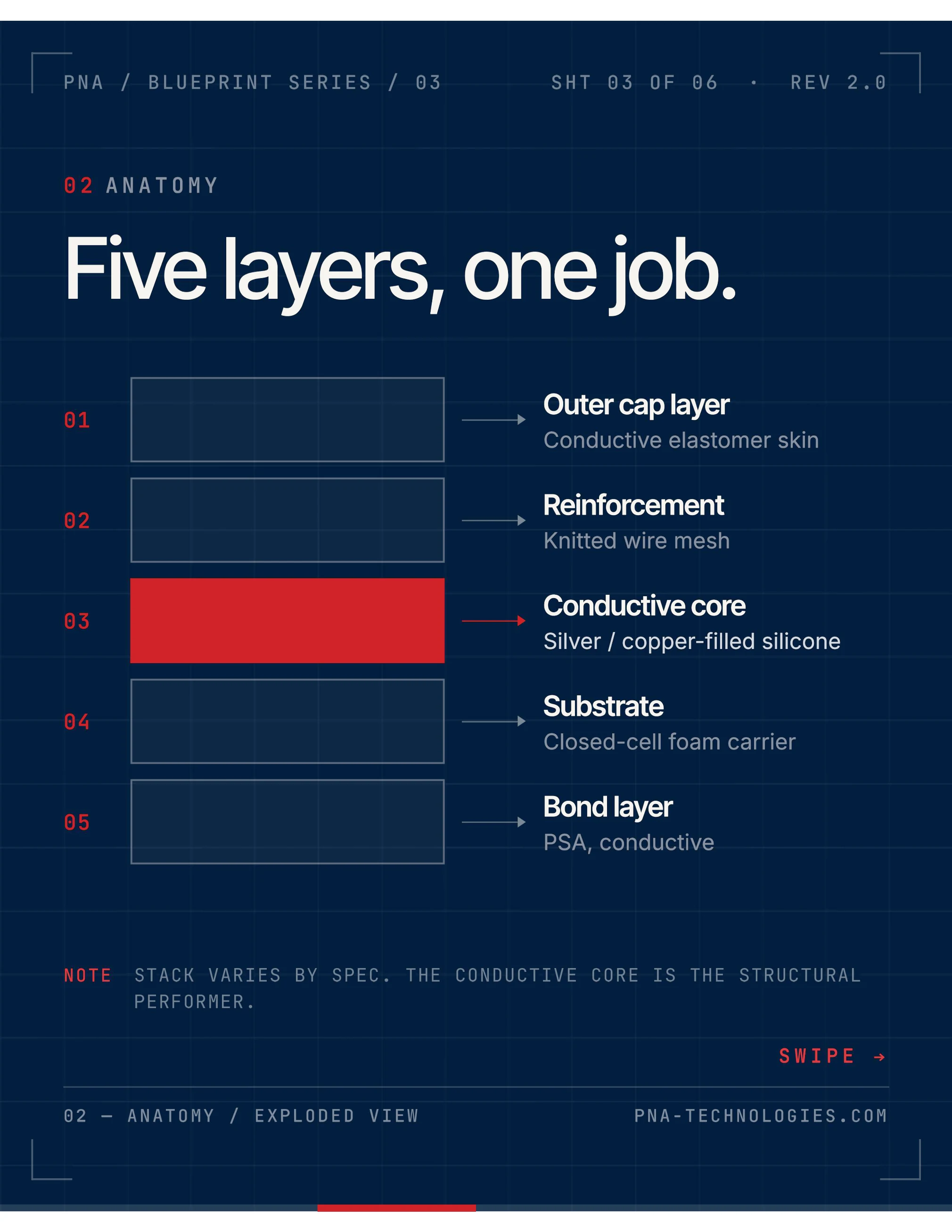
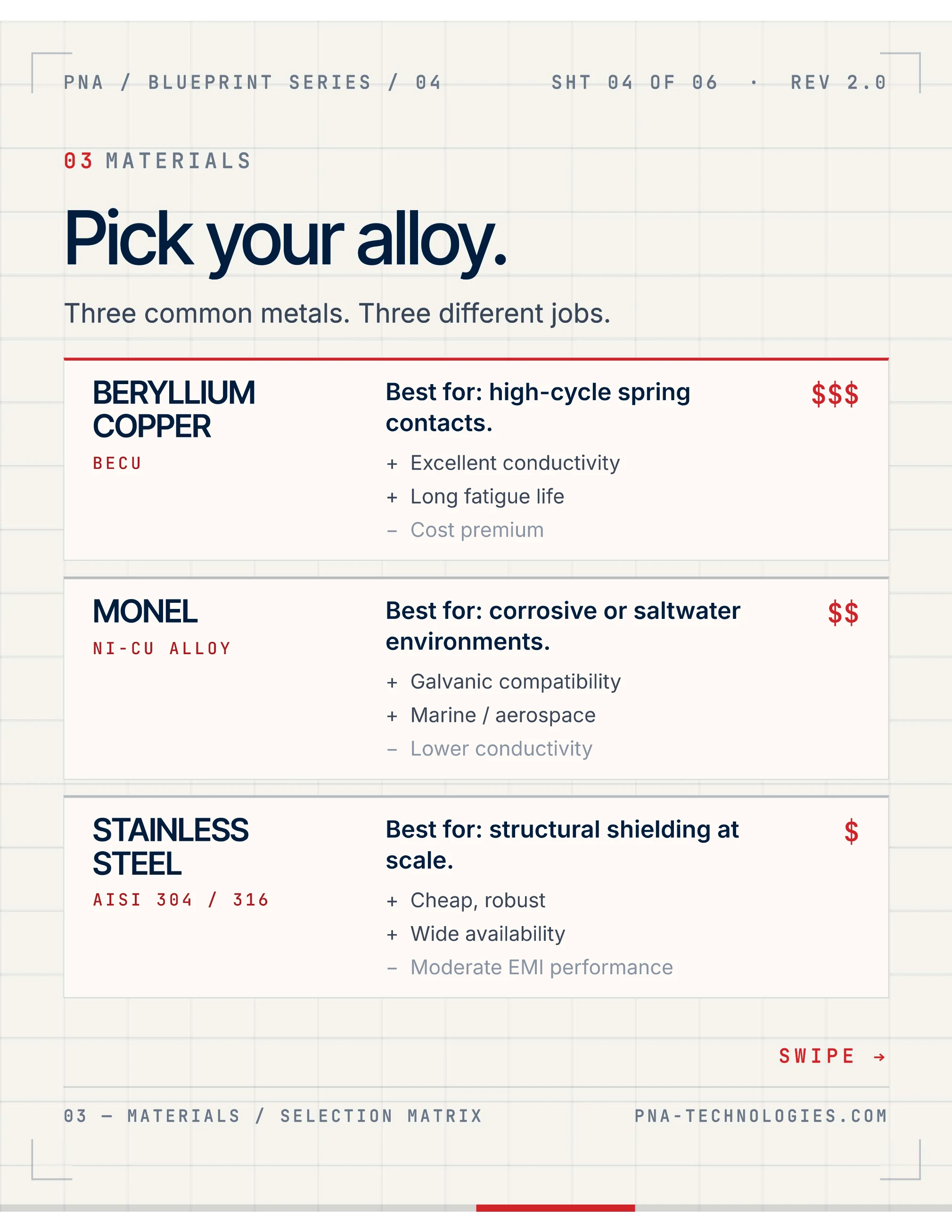
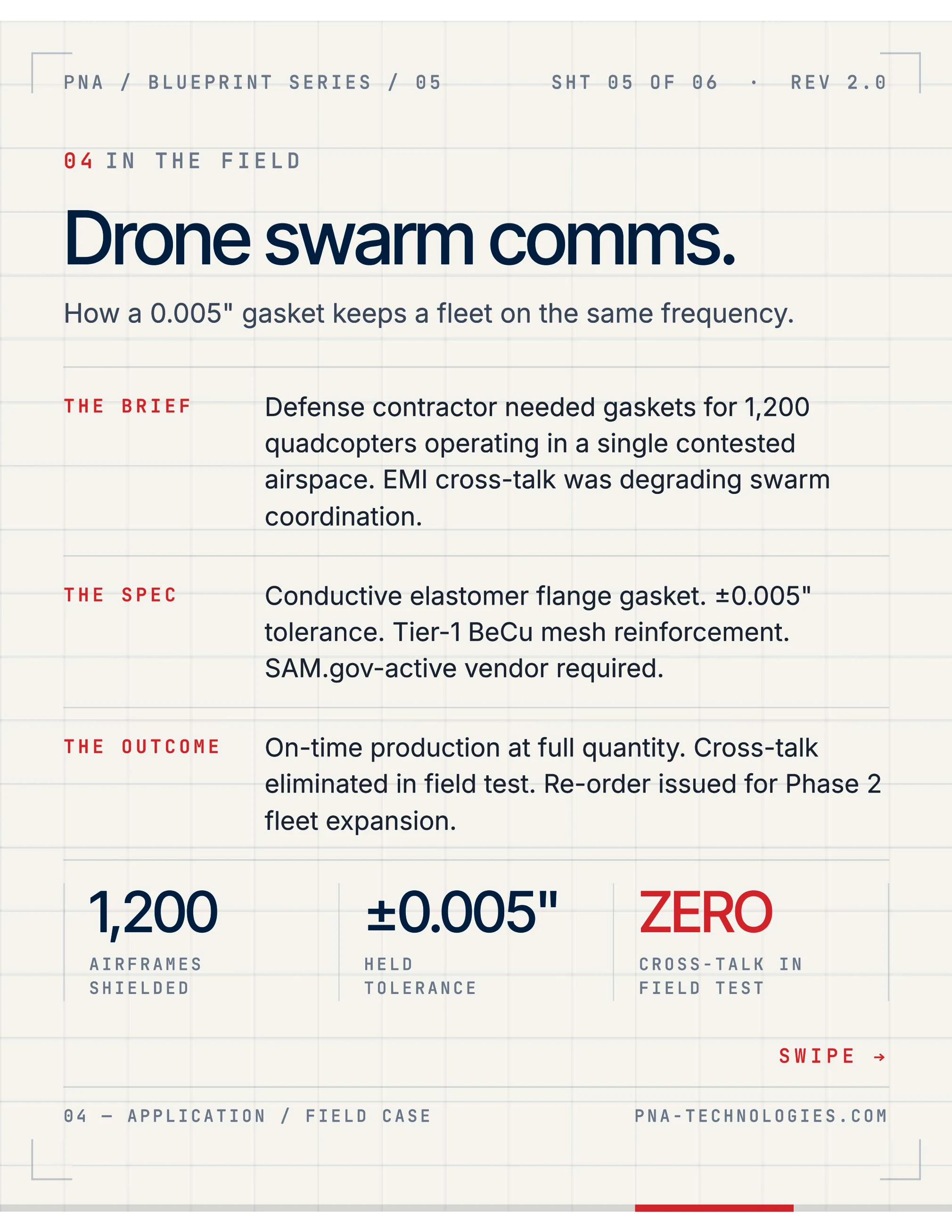
I built the identity around the engineering drawing. Spec-sheet framing, dimensioned callouts, monospace metadata, and a strict modular grid turn every asset into something that reads like shop documentation.
The brand equivalent of a part that passes inspection: measured, technical, and made‑in‑USA serious.
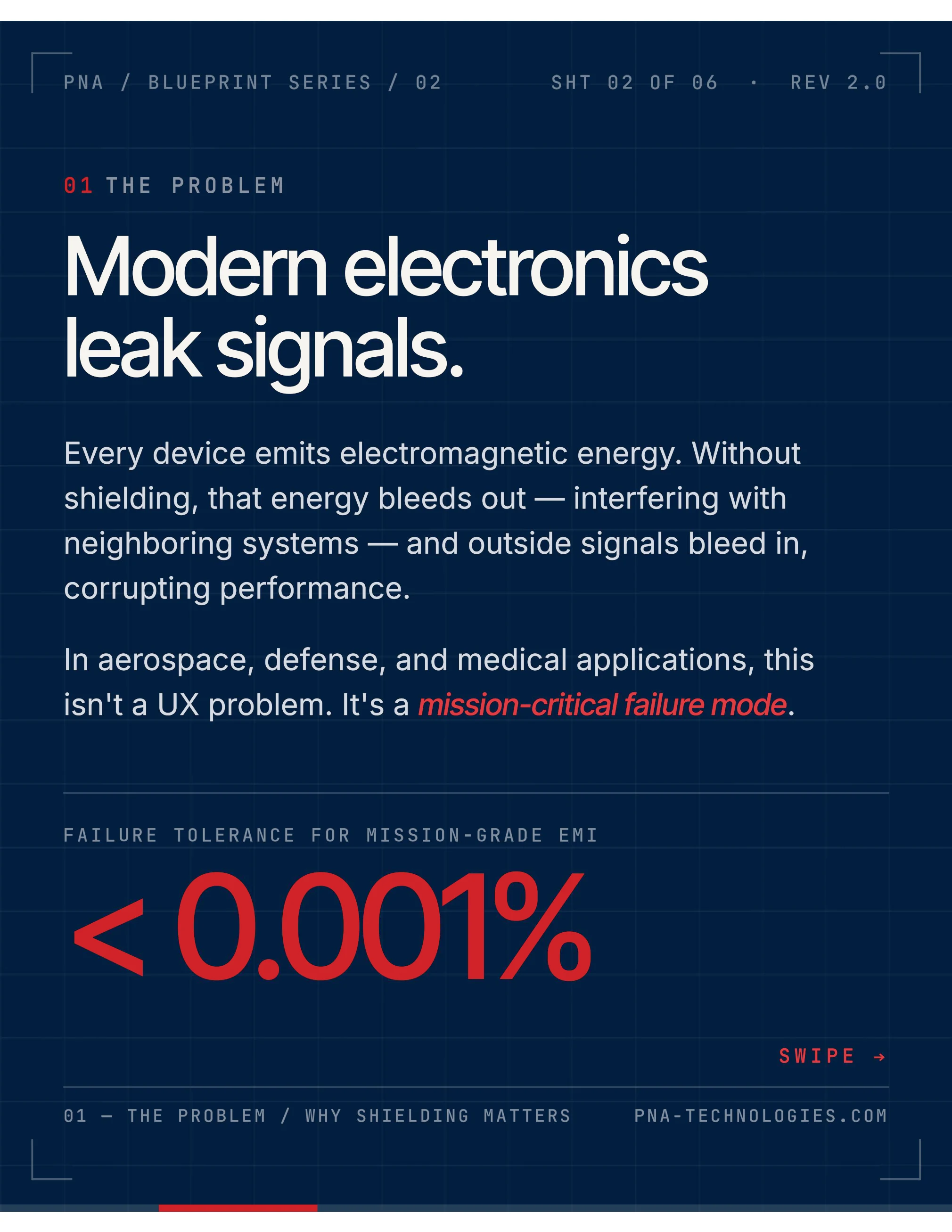
A dark navy ground holds high-contrast type and a single signal-red accent for emphasis and status. Headlines run in a confident grotesk; data and labels sit in monospace to echo CAD output.
A persistent footer rail (title, section, revision, standard) frames every page like a part drawing under revision control.
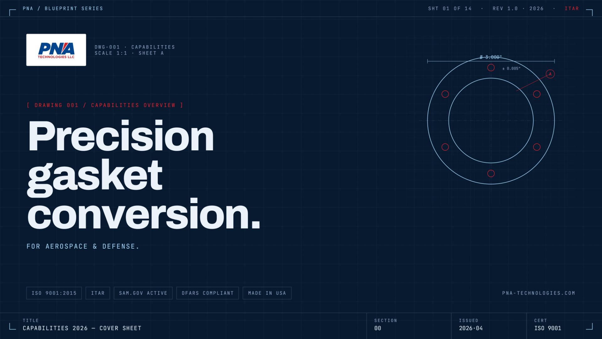
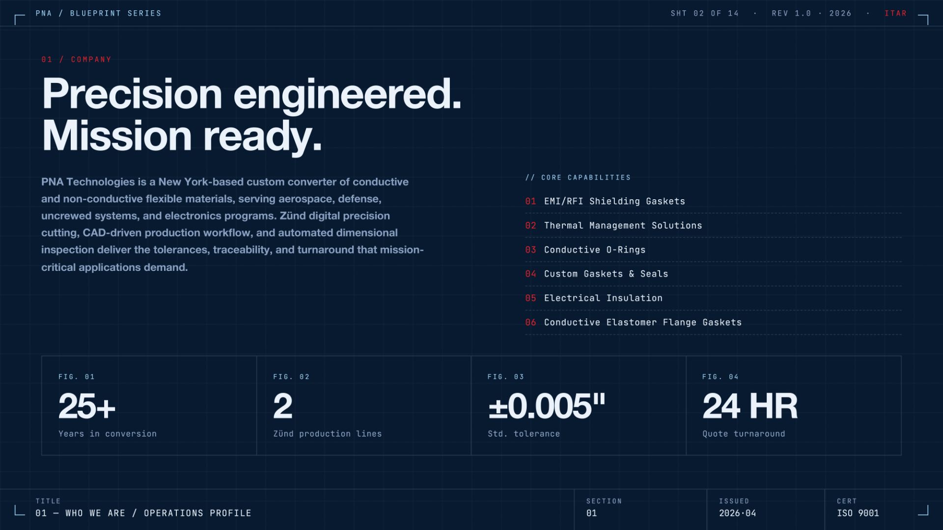
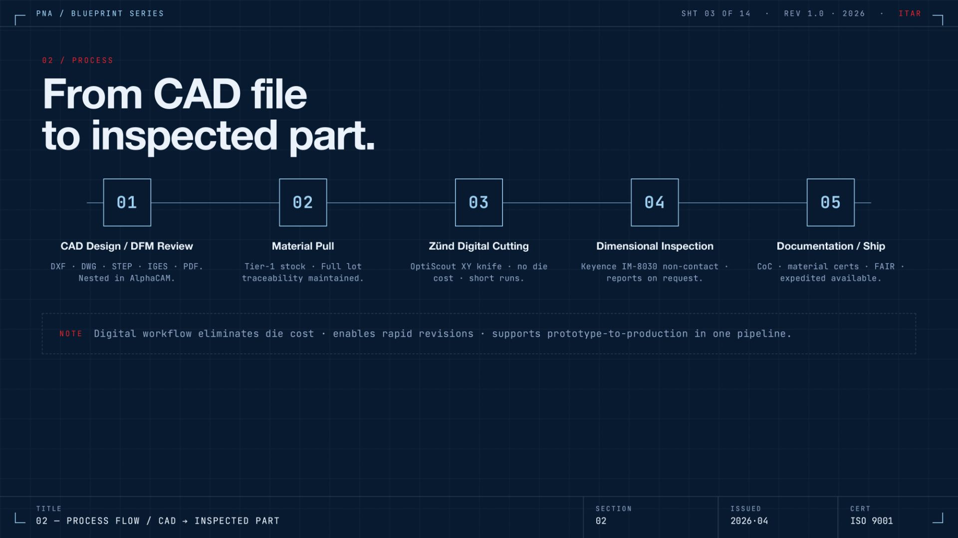
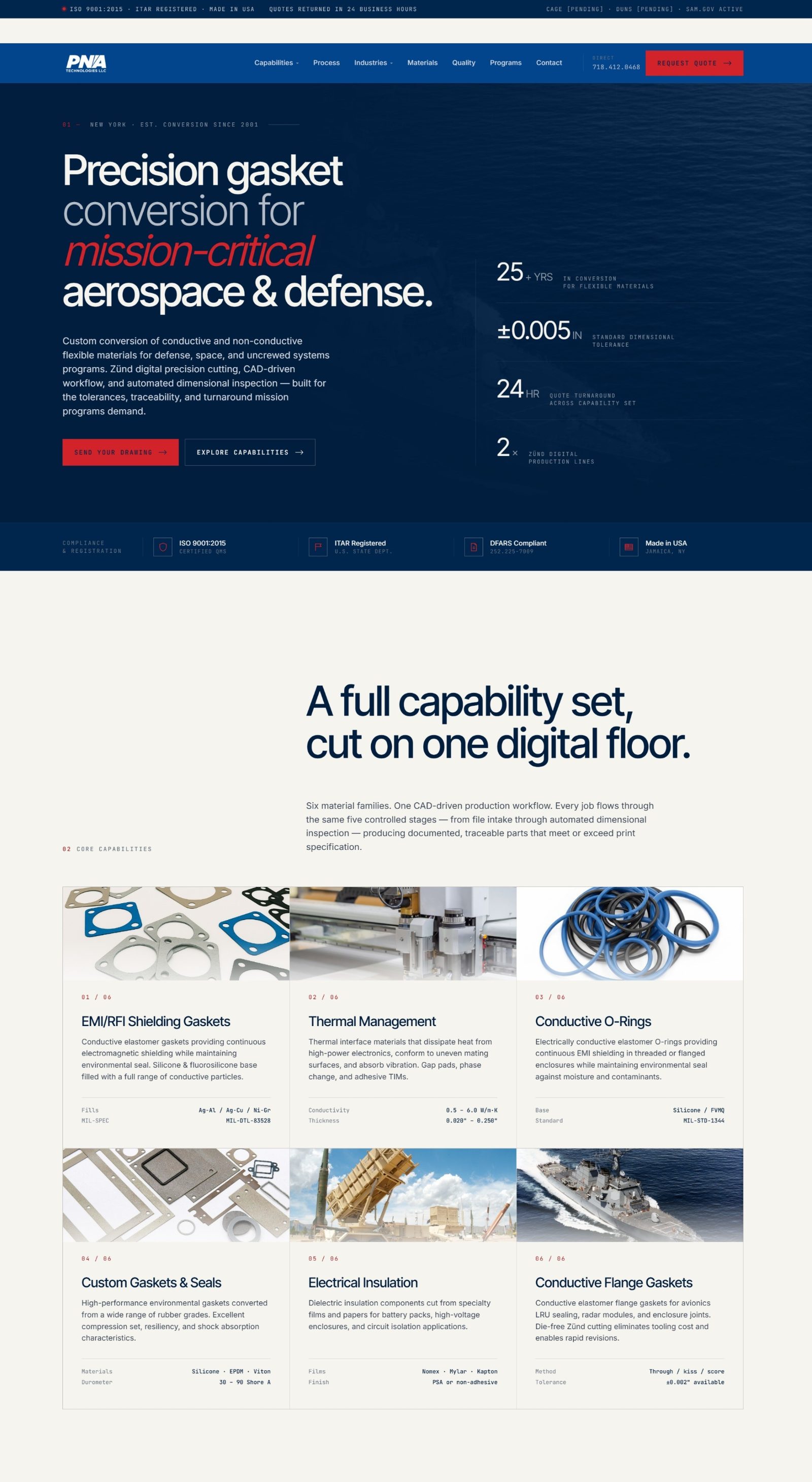
The same system flexes from the printed deck to a responsive marketing site to a six-slide social carousel, "Anatomy of a Shielding Gasket", that translates dense technical knowledge into a scrollable, platform-native format.
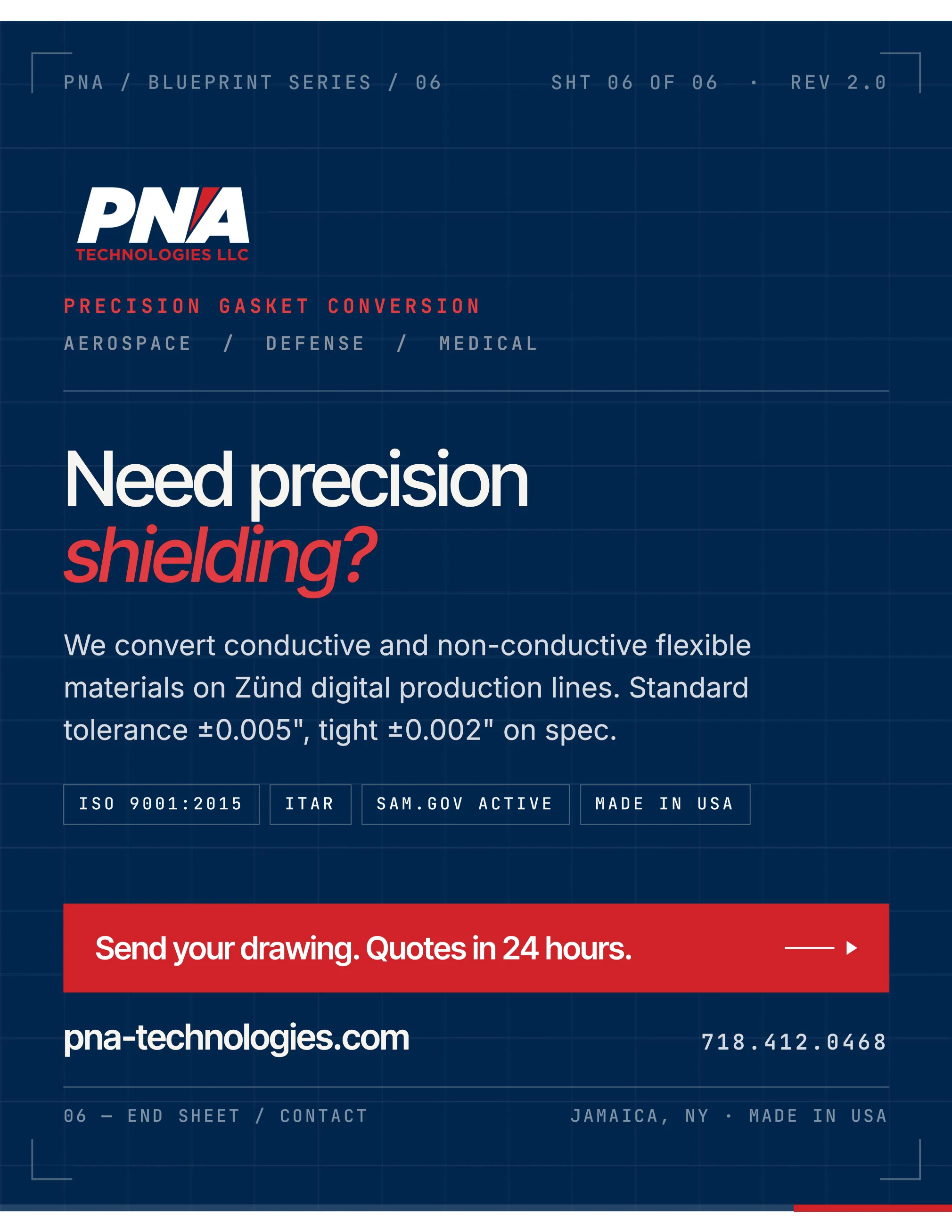
Everything traces back to one wordmark: an italic, forward-leaning PNA cut by a single red stroke, set over Technologies LLC. It runs in full color on light backgrounds and reverses to white on the dark blueprint layouts.

PNA now presents one continuous voice across every touchpoint a buyer meets (sales, web, and social), matched to the precision of the work itself.
One system. One standard. Mission ready.